Tablix Tutorial - Reporting Services
Table + Matrix + List = Tablix
The tablix, the SSRS vehicle used to display rows of data, is a new report item introduced in SQL Server Reporting Services 2008. Three previous report items: the table, the matrix, and the list, were combined into one: the tablix, due to their similarities. A view of what the tablix contains is shown in Figure 1.
Figure 1. Tablix View
To start using the tablix, look at the Toolbox in Business Intelligence Development Studio (BIDS); however, you will not see a tablix report item. Instead, you will see the table, the matrix, and the list are shown separately, as seen in Figure 2. No matter which item you pull to the designer, Reporting Services will still use a tablix under the covers.
Figure 2. Toolbox Showing the Tablix Templates
Note: If you do not see the Toolbox in BIDS, click the View menu > Toolbox selection or type Ctrl + Alt + X. In the Toolbox, all report items are under the Report Items header. |
Let's start by looking at the first tablix template, the table.
Table
A table is simply an object that displays rows of data that can be grouped and aggregated. If our data contains a static list of columns, we want to use the Table report item. Let's start by pulling over the Table report item from the Toolbox. Since we've already created our data source and dataset, we can start setting up the table. Let's begin by selecting data for the table to display. Each report item can only show data from one dataset, so you will need to specify the desired dataset. Set the dataset by going to the Properties pane > DataSetName property > and selecting your dataset. The Properties pane can be seen in Figure 3.
Figure 3. Properties Pane with DataSetName Property
Now, we can use the dataset fields to design the display of the table. There are a few different ways to set up the fields on our table:
· Pull over the field from the Report Data pane
· Select the field from the drop down list in the top right corner of each textbox as shown in Figure 4
· Go into the textbox's properties and select the field from the dropdown list
Figure 4. Table Field Selection
Whichever method you use, a simple layout will look similar to Figure 5.
Figure 5. Simple Table Layout
Grouping
A tablix displays a table row for every dataset row through the "Details" group. The Details group provides a basis to help us understand other grouping concepts. Every time Reporting Services sees a unique row, it will create a new detail group. In the same way, additional groupings will create a new group for every unique value that it finds. Let's walk through creating a group to illustrate the concept.
Begin by going to the Grouping panes. In editions prior to SSRS 2008, you can find these panes under the Properties window of the table and matrix. In later editions, you will see these panes at the bottom of the designer in BIDS, as shown in Figure 6.
Figure 6. Row and Column Grouping Windows
Because we are working on a table template, let's create a row group. Select the down arrow to the right of the Details group in the Row Groups pane. You have multiple options, including Add Group. Select the Add Group option > Parent Group option, and select the desired column. Check the checkboxes to include a group header and footer in the Tablix group window. A completed screen can be seen in Figure 7.
Figure 7. Completed Tablix Group Window
Once you select OK, you will see the table design, as shown in Figure 8.
Figure 8. Table Design with Group
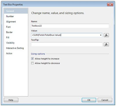
You describe each column by typing a title or aggregation into the header row or footer row. Let's create a total for the group by using an expression. Right-click on the intersection of the last column and last row of your table. Each intersection contains a textbox, so you are actually clicking on the textbox that marks the spot! Select Text Box Properties… to open the Text Box Properties screen. In the Value field, enter =SUM(Fields!TotalDue.Value) as shown in Figure 9.
Figure 9. Text Box Properties
Before running the report, let's look at the matrix template of the tablix. We discussed grouping before covering the matrix because it is the core of understanding the difference between a table and the matrix, coming up next.
Matrix
While very similar to a table, the matrix adds the ability to group and aggregate on columns as well as rows. This results in the display of data growing along the x-axis as well as the y-axis. You create column groups similar to row groups, except instead of making the changes in the Row Groups pane, you use the Column Groups pane. An example of a report that utilizes the matrix template shows sales for each country for several months. The design view of this report can be seen in Figure 10.
Figure 10. Matrix Layout
List
The list is often forgotten when discussing the tablix because it just too darn simple! A list contains one row and one column and repeats for every dataset row. If you need to create a report that doesn't follow any of the formats we've seen up to this point, you'll want to use a list. You can place textboxes within the list to create a freeform design to match any design your end users can dream up.
Formatting
Your end users may also want to format the data in different ways. Because formatting is applied at the text box level, you can make these changes to the tablix in table, matrix, or list form. On our existing table-based report, let's make some formatting changes: Column sorting and Font properties.
Column Sorting
Almost every report you write needs column sorting to show your data in a particular order. Begin by single left-clicking anywhere in the tablix. Once the table is highlighted, you will see a little gray square in the top left corner of the tablix. Right-click on this square, and select Tablix Properties…, as shown in Figure 11.
Figure 11. Select Tablix Properties window
In the Properties window, select the left menu entitled Sorting. Select the desired column under Column, and A to Z underOrder to sort the column in ascending order. The completed screen can be seen in Figure 12. Click OK to exit the menu. Keep in mind that any group can also have a sort, so if the output is not as expected, ensure other sorts are not overriding the one you just created.
Figure 12. Completed Sorting Pane
Font Properties
Next, let's move onto font properties, a fancy term for making the font look pretty. To use this feature, select all header columns in the tablix. In the Properties pane, go to the Font property > FontWeight property > Bold selection. Selecting this property can be seen in Figure 13.
Figure 13. Properties Pane with Font Property Selection
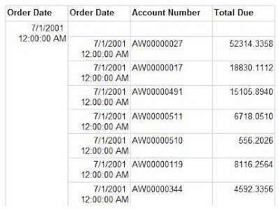
After all of the preparing, grouping, and formatting, we have a finished report! Select the Preview button to see what we have completed up to this point, as shown in Figure 14.
Figure 14. Final Report View


Nice article....very helpful..thanks...
ReplyDeleteSuch A Wonderful Article... Helped Me a lot.
ReplyDeleteHi Mukesh,
ReplyDeleteIs there any way that we can show header only one time in details group and I have also check by adding a row outside the group but it does not help me.For e.g In ProdPickList report when we don't select the dimension then standard report show in improper way..... values don't comes below the labels.Please help.
such nice collection
ReplyDeletejbmtqr
ReplyDelete